Menu
INK & CLAY 44 ARTISTS' STATEMENTS


%20_000130_688293_230689_6303.jpg?crc=134106037)

.jpg?crc=151432995)
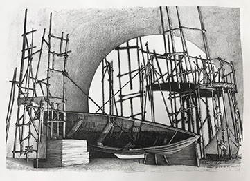
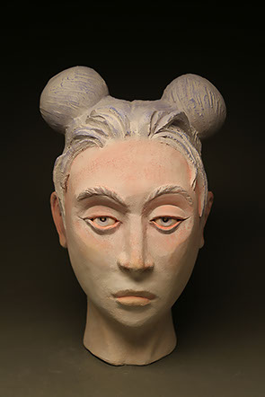
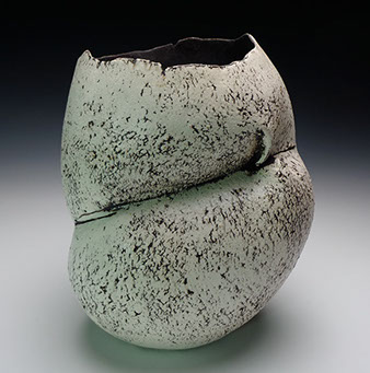
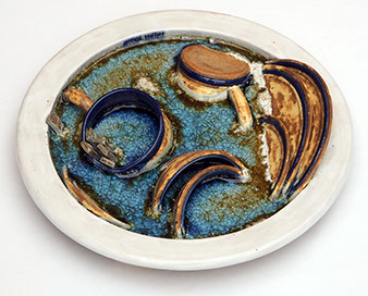
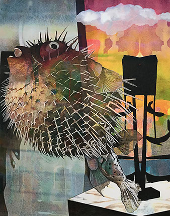
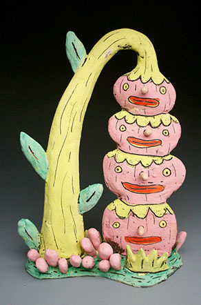
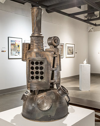
Pascual Arriaga
Collateral Damage: Sailor, Soldier, Marine, 2017
porcelain slip sast ceramic, cone 05, ammo cans
31 x 34 x 20"
Courtesy of the artist
Collateral Damage – the general term for deaths, injuries or other damage inflicted on an unintended target. One might argue that a soldier, sailor, or marine cannot be collateral damage because they are combatants who have chosen to fight. I argue that many of these young people do not have a choice, and society makes them fight. The loss of one’s innocence and soul is the collateral damage.
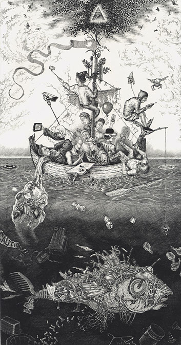
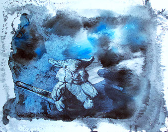
David Avery
Das Narrenschiff, 2018
hard-ground etching
14.25 x 7.5“
Courtesy of the artist
I am happy to report that my fourth and final etching from the series based on the sixteenth century engraver Hendrick Goltzius’ The Four Disgracers is complete. Titled Mendacia Ridicula (The Wheel of Ixion), it is derived from the most detailed and complex of Goltzius’ four engravings which, in turn, were based on paintings by the Dutch artist Cornelis van Haarlem. Updated to reflect current curses of humanity, this image in particular will delight, edify, or offend, depending. And to those who demand more civility in public discourse while cravenly enabling insanity, I can only reply, “Mendacia Ridicula!”
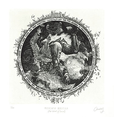
David Avery
Mendacia Ridicula (The Wheel of Ixion), 2018
hard-ground etching
6 x 6“
Courtesy of the artist
The medieval Ship of Fools trope tapped into by Brandt has probable origins in an excerpt from Book VI in Plato’s Republic.
Modern concerns combined with indiscriminate anachronism take precedence in my new work, and everyone should be beginning to wonder what that taste is when they bite into their next tuna sandwich.
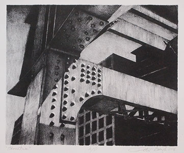
PETER BACZEK
Structure, 2018
lithograph
7.5 x 9“
Courtesy of the artist
The dynamics and backbone of the urban environment are steel structures as the important element to their existence. This view captures the geometry and strength of these “bones” that hold our cities together.
DEANA BADA MALONEY
Nectar, 2019
stoneware and found objects
7.5 x 4 x 2.5”
Courtesy of the artist
Nectar and Splitting Hare are pieces from a series that I am continuing to make pieces for called The Nature We Create. The series reflects how wild animals have to adapt to our landfill problem.
DEANA BADA MALONEY
Splitting Hare, 2019
stoneware and found object
5 x 12 x 5”
Courtesy of the artist
Nectar and Splitting Hare are pieces from a series that I am continuing to make pieces for called The Nature We Create. The series reflects how wild animals have to adapt to our landfill problem. 2
MARIONA BARKUS
Unknown 30, 2017
acrylic ink, acrylic paint on canvas on panel
24 x 24 x 2”
Courtesy of the artist
Nectar and Splitting Hare are pieces from a series that I am continuing to make pieces for called The Nature We Create. The series reflects how wild animals have to adapt to our landfill problem. 3
BRANDON BARON
Wanted: Shoplifter, 2018
silkscreen on cotton paper with mixed media
10 x 13“
Courtesy of the artist
Wanted: Shoplifter documents surveillance techniques that create modern day “Wanted” posters. My compositions are created through a fusion of photographic and hand-drawn layers, composited in Photoshop, and printed onto vellum. Additional layers of ink and varnish are applied through experimental printmaking techniques to achieve the final finish, with a limited print run of three per image.
ALEXANDRA BASFORD
Crowd Scene, 2019
Sumi ink on paper
15.5 x 10.3“
Courtesy of the artist
Crowd Scene is a representation of the jumble and loneliness of crowds. I utilized the unpredictability of poured ink to evoke feelings of movement and jostling, as well as gradation in density between the center and edges of the crowd.
ALEXANDRA BASFORD
Bag, Banana and Carrot
from the series of
Grocery Stories, 2018
screen print on brown
“shopping” bags
17 x 12 x 7” each
Courtesy of the artist
The connection in all my work is the human search for meaning through order, and the arbitrary nature of the order we create. My most recent work has veered toward text based art with the goal of choosing a process, imagery, and medium that adds layers of understanding to the words.
Bag, Banana, and Carrot are a series of Grocery Stories, in which my search for order and perfection in mundane tasks is taken to the point of comic absurdity. The humorous self-deprecating text is echoed by the ridiculous effort of multi-color screen printing on lumpy, ubiquitous grocery bags.
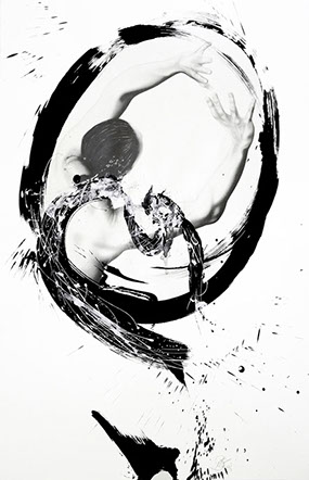
MICHELE BENZAMIN-MIKI
Momentum, 2015
graphite and sumi ink on paper
43 x 28“
Courtesy of the artist
Momentum is the expression of the feminine emergence of spirituality. The female form is breaking out of the constraints of society, religion, and old traditions of spirituality towards a new expression of power, strength, and leadership, which embraces intuition, flow, and grace. This image is inspired by my years of experience studying, practicing, training and teaching the non-violent martial arts form of Aikido and Japanese sword forms, as well as meditation.
Placed on pedestals, these works juxtapose the commonplace with the prestige of fine art exhibition.
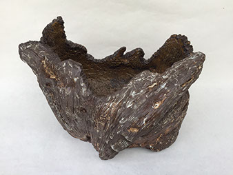
REIKO BERG
Pine Tree Stump Vessel, 2019
clay
9 x 14 x 10”
Courtesy of the artist
Natural objects, such as the stump of an old tree have great beauty. The worn bark shows the years of wear, as well as the rings of an old tree can be counted to indicate its actual age. Natural objects tend to age gracefully and display subtle variations in color and texture. These items are discovered usually by accident, like finding a beautiful piece of driftwood on the beach. By acknowledging the beauty, picking up the object and taking it home, you breathe life into the once lifeless piece and others soon share in your vision.
A. BINGHAMFREEMAN
Standing Figure, 2018
clay and glaze
15 x 9.5 x 4.5”
Courtesy of the artist
Standing Woman is made from cone-ten clay with a black underglaze. I especially enjoy the tactile and expressive nature of clay. I much admire 20th century art. It combines expression with simplified form, which is not as easy as it sounds. Sculpture is often referred to as plastic in form, especially 20th century sculpture. I enjoyed pulling and pushing this figure together and was interested in crafting expression with figurative form. The stance is pushing against conventional ideals and makes the statement of strength and dignity. The standing figure is a representation of the courage and fortitude of the female figure.
IRINA BONDARENKO
Tea Caddy VII, 2018
low fire terracotta, sgrafitto
on terra sigillata
5 x 10 x 7”
Courtesy of the artist
It’s mesmerizing to see how a gesture of a drawn line, a form, or an artistic expression can transcend borders between countries and can resonate over and over again through the centuries. In my work, I love to explore these connections of new and old, distant and local, and interweave my daily reflections with old ceramic traditions.
My recent work is inspired by the Oribe tradition, the magic of a broken pattern, and the power of an obstructed view. When working with clay, I am keen to explore the intertwining of predicted patterns and random fluctuations. Although my materials and surfaces are different from those used in 16-17th century Japan, I feel that my work is connected to the Oribe tradition of the pursuit in the subtle beauty of incomplete.
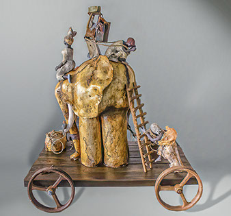
NUBIA BONILLA
Wisdom and Loyalty, 2019
hand-built coil, white clay,
horse hair, wood, iron wheels
38 x 32 x 24”
Courtesy of the artist
With this work I want to transmit the harmony between man and elephant. I have incorporated earthenware, porcelain, slips and oxides to recreate a daily image of mutual help between humans and animals.
More and more, man invades the geographic habitat of the fauna, reaching harmful consequences, making it necessary to find the key to reduce the conflict between them.
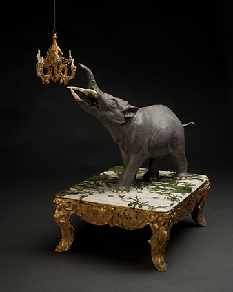
ARIEL BOWMAN
Passé Doré, 2017
ceramic, flocking, gold leaf, wax
36 x 22 x 14”
Courtesy of the artist
The picturesque aesthetic of the eighteenth century refers to a time when our relationship to nature was being expanded by scientific discoveries, yet separated by the disappearance of wild places. In Passé Doré, as in every scene that I create, is a fantasy inspiring curiosity about the unknown animal, while nourishing the imagination of the viewer with intricate details. Mysterious giants wander through palatial ruins, discovering the overgrown remains of monuments to human greatness. Moss and vines cover the fossils of civilization, and show the effects of time in their decay.
My work uses reflective nostalgia to present these extinct animals within the context of human history. The unexpected combination of such contrasting timelines questions reality, and rekindles a childlike fascination with the animal world.
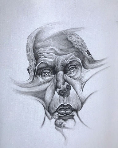
CHESS BRODNICK
It’s not what I wanted it to be, 2019
Sumi-e ink on paper
26 x 19“
Courtesy of the artist
We all experience moments of emotional impact when something upsetting occurs. This piece is a portrayal of my physical and emotional reaction the instant an event impacts me. I am depicting both the external and internal process of a human reaction at a moment in time. Abstraction and reality reflect the human condition emphasizing that different viewpoints or aspects occurring simultaneously is a shared experience by us. This piece is a mirror allowing us to recognize our humanity and all that accompanies it.
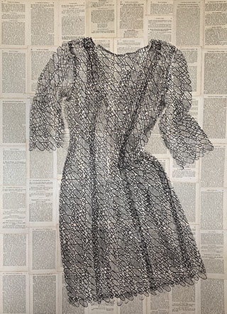
ANDRA BROEKELSCHEN
Lace, 2019
monoprint oil-based ink on old bible pages
43 x 31“
Courtesy of the artist
Lace ( laqueare ) in Latin means “to enclose in a noose, trap.”
Sheer graceful lace over well-worn, old Bible pages.
Are the words trapping the lace, or is the lace putting a noose around the words?2
MARIA BRUCKMAN
In pari delicto, 2018
porcelain, acrylic, resin, pins,
baroque pearls, fibers
10.5 x 9 x 15”
Courtesy of the artist
My work is about the human body. I explore the relationships and attitudes related to how we treat, view, and perceive our own bodies and the bodies of others. Our bodies, just like our views and tastes, are different and beautiful in their own special ways. I want to convey that these differences are an important part of what makes us unique. I want the viewers to embrace that uniqueness no matter how different it is.
As an interdisciplinary artist, I create sculptural pieces using porcelain and mixed media such as resins, fibers, wires, pins, and pearls. The scale and surface finishes play an important role in my art as I like bringing the viewer closer to my pieces, allowing a pause, and creating a more intimate moment while viewing my work.
MATT BRUGGER
Portrait, 2019
glazed ceramic
32 x 7 x 14.4”
Courtesy of the artist
My work examines distance and dependence between individuals, or on our memories or situations, which translates to physical space between ceramic objects. Drawing on the intimate nature of clay and playing with the distance and engagement between objects allows me to consider how those objects might be experienced from different perspectives and possible narratives that express the human condition.
Clay is delightfully tactile and has the ability to heighten our connection with the life of the object. I am fascinated by clays permanence and tactility, drawing influence from handheld artifacts and monolithic stone monuments of prehistory as records of utility and mythos. Through my collaboration with clay, I imbue forms with my own mythologies, transforming them into ritual objects. Acting as reliquaries for the human condition, these precious objects take on lives of their own, and become meaningful connections between lives - present and long past.
VINCENT BURKE
Double Negative, 2017
stoneware, gas-fired cone 6, electric-fired cone 04
11 x 8 x 1.5”
Courtesy of the artist
A toxic brew of subjective and cultural relativism is eroding many cultural, moral, and philosophical systems that arguably once bound us together. I am curious about these and other systems; their genesis, why they failed, and what springs up to fill the void.
My work is a response to these systems and their failures which looks as if it once belonged to a larger whole, but is now fragmented, partially erased, and obscured. There are hints of structure and patterns that may have held some significance, but that meaning is now indeterminate. What’s left are the remains –degraded and unbound– a visual metaphor for our time.
ADRIENNE BUTLER
Intention, 2017
screen printed watercolor monotype
15 x 11“
Courtesy of the artist
I do not envision what a given finished painting or print will look like. I start with color and build atmospheric fields to support forms. Each form is a feeling. I stack these forms like piles of books on a shelf. Time passes as I build layers. Blot it, wipe it away. Start over with a new thing, a new time, a new place. The process is an outlet for me to work towards becoming content with the unknown. Just as chance encounters impact our lives, I want to allow chance brushstrokes to change the outcome of an image. I want you to feel something in this moment. There is only this: now –a feeling that touches the heart, that touches the hand, that touches the brush to the paper.
There is joy in mystery. Yet personal growth is primarily a search for meaning and for definition. My process is a reinforcement of these conflicting ideals –an embrace of both the mystery and the meaning. The ability to bend, stay pliant, to accept and even welcome change is a valuable skill and one which I hope reflects in my work.
KYLE CHAPUT
Rio Bravo II-II, 2019
lithograph
9 x 13“
Courtesy of the artist
I do not envision what a given finished painting or print will look like. I start with color and build atmospheric fields to support forms. Each form is a feeling. I stack these forms like piles of books on a shelf. Time passes as I build layers. Blot it, wipe it away. Start over with a new thing, a new time, a new place. The process is an outlet for me to work towards becoming content with the unknown. Just as chance encounters impact our lives, I want to allow chance brushstrokes to change the outcome of an image. I want you to feel something in this moment. There is only this: now –a feeling that touches the heart, that touches the hand, that touches the brush to the paper.
There is joy in mystery. Yet personal growth is primarily a search for meaning and for definition. My process is a reinforcement of these conflicting ideals –an embrace of both the mystery and the meaning. The ability to bend, stay pliant, to accept and even welcome change is a valuable skill and one which I hope reflects in my work.2My work is an attempt to reveal internal struggles with a chronic illness while referencing chaotic, often conflicting aspects of ‘border’ life. These aberrant sites and abandoned still lifes reflect a broken condition within an alienated community –the Rio Grande Valley.
The manifestations of these vessels tend to pierce through subconscious thoughts, forcing me to continually question my sense of place and inner stability.
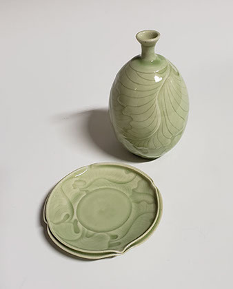
NORA CHEN
The Mystic Leaf Bottle and Saucer, 2018
wheel-thrown, hand-carved, high-fired reduction
6 x 4.5 x 4.5”
Courtesy of the artist
The Mystic Leaf Bottle and Saucer is hand carved with leaf design that overlaps such that there is no beginning and no end. The Mystic Leaf Bottle and Saucer were glazed with green celadon to accent the carving details.
Working in porcelain, I especially love the translucency and light reflections of the glaze/body fusion at high temperatures. I also love the sensuality of the porcelain; it is the silk of ceramics.
In this bottle and saucer I experimented with texture, patterns, and the interplay between order and randomness. This interplay was created to be functional, like a Saki bottle, but also to intrigue the eye. I try to capture the spirit of nature by changing the real leaf impressions to something more free form and flowing to add motion into my work.
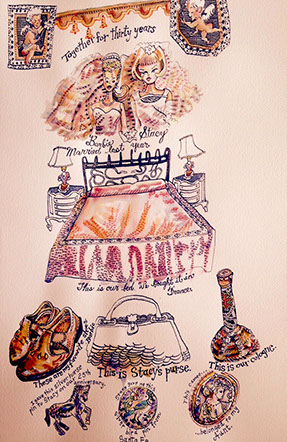
CHUKA SUSAN CHESNEY
Just Married After All These Years, 2016
watercolor, pen and ink, brush and ink, pencil
20 x 13“
Courtesy of the artist
Barbie and her best friend Stacy are lesbians and have lived together since the late 1960s. They got married a few years ago. This painting documents their wedding and also their relationship. We see their bed and gifts to each other over the years including perfume and shoes. There is writing next to objects, telling the story of their life and love together.
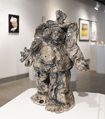
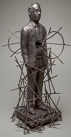
BRIAN CHRISTENSEN
Maintaining a Tenuous Construct, 2017
ceramic, steel
25 x 10 x 13”
Courtesy of the artist
Maintaining a Tenuous Construct is a figurative ceramic sculpture, which explores the will-power required to maintain a belief, regardless of its validity. There is something of Don Quixote ‘tilting’ at windmills in this work. It includes climate change deniers, justice warriors, utopians and anarchists, TED Talks, conservative talk radio, and basically all of us in the same thought. The work deals with the arrogance and absurdity in the certainty of moral and intellectual superiority. The work is a folly, but also a romantic depiction of the self-constructed power of belief and determination aside from cynicism.
Maintaining a Tenuous Construct also deals with the beauty in tragedy and failure, the dogmatic tenaciousness required to hold on to a dead idea in the face of evidence. What makes us do this? What pride and self-consciousness drives us to protect an ideology as if it were a suffering child? In art, I can’t offer a lot of answers. I’m mostly embroiled in questions.
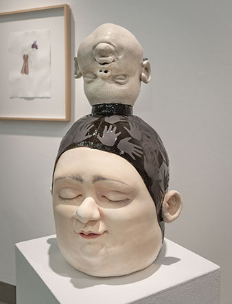
BRIAN CHRISTENSEN
Not My Monkeys, Not My Circus, 2018
ceramic
22.5 x 13 x 16”
Courtesy of the artist
Not My Monkeys, Not My Circus is a twice life size ceramic head, which evokes a resistance to societal norms and forces. It is a memorial to the individual spirit. The title refers to a modern Polish proverb “These are not my monkeys. This is not my circus.” My interpretation of the meaning of the proverb is that a person has the right to walk away from the expectations that others place on them in order to stay true to themselves.
The head that I chose to represent this idea is that of a young woman. As an old white man who often teaches young women and a diversity of people in the classroom, I have to ask myself, “How often do I impose my values on others? How well do I listen? Am I an advocate or an obstacle?” Some of the societal absurdities that I faced in my own life remain absurd. I want to salute the people who follow their own moral path despite punitive pressure to conform.
MELANIE CICCONE
Ascension, 2016-17
Chine collé monoprint
13.5 x 11”
Courtesy of the artist
Ascension
begun in darkness,
a seed knows exactly what to do.
ushering forth –unselfconsciously if at all possible. be patient
be present
to self and the world.
Be a single flower,
unafraid of what comes next
that is enough–
an endless act of becoming, and un-becoming
That is hope.
Beyond multitudes,
blossoms remind us that we were also built for beauty, and for whimsy.
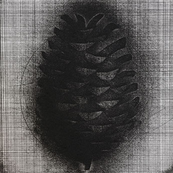
BRIAN D. COHEN
Pine Cone, 2015
etching
5 x 5“
Courtesy of the artist
I start out my etchings broadly but with a clear geometric underpinning. The process of etching is physical and elemental, requiring force and pressure, inviting aggression and then delicacy, conjoining fire, water, earth, and air. I embrace themes of loss, futility, destruction, and unexpected, redemptive beauty. Themes tied to the tradition of printmaking, whose imagery has always tended toward critical commentary and serious contemplation, and often toward humor and irony as well. The etchings in this series are based on the form of the 17th century emblem book. The historical book intended associations and diverse meanings of key elements of the world in schematic and formal spatial arrangements. The emblem book envisioned the universe as ‘like a book or mirror of our life and death’, and objects in the world as invested with immediate and enduring universal significance.
SARAH COLLINS
Here I Crawl, 2019
fine liner pen on toned paper
11 x 4”
Courtesy of the artist
I recently became fascinated with intricate, small details using the smallest fine liner pen I could find (.03 Copic Multi-liner).
I didn’t have a plan for this drawing, and started making lines at different thicknesses, and defined the forms using mostly stippling. I am automatically drawn to forms that appear alien-like, intestinal, or phallic, and enjoy the idea of the forms working independently yet connected by a seemingly insignificant vein. As their existence depends on the connection, they appear forced into isolation.
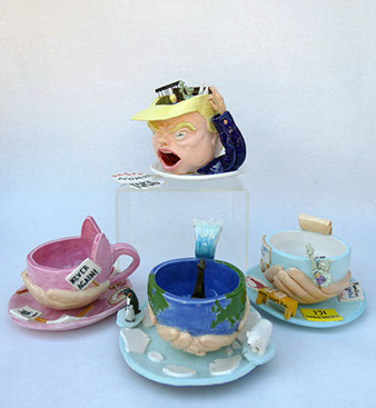
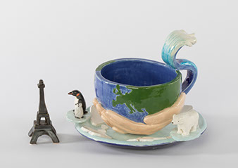
SARAH COLLINS
Resistance Cup Set, 2019
ceramics
7 x 8 x 8” each
Courtesy of the artist
This Resistance Cup Set represents three resistance movements to the Trump administration and the values he represents. The first cup does not hold water and is the catalyst for the rest of the set.
The hands in the three resistance cups stand for the support given to these causes by the masses. The Women’s Resistance Cup depicts the pink hat worn at marches and actual picket signs carried by protesters. The Environmental Tsunami Cup handle is a giant wave representative of rising sea levels and increased frequency and destruction of storms. The Eiffel Tower either sits inside or outside the cup regarding the sink or swim option in deciding to remain in the Paris Climate Accord or not. The polar bear and penguins float on individual icebergs in waters of broken sea ice. The Support for Immigrants Cup is lead by the Statue of Liberty holding a Dreamer child –the billboard speaks to sanctuary cities. A desk on the saucer represents free legal services that were offered by lawyers pro-bono at airports during the Muslim ban. The saucer depicts signs carried in protests defending immigrants and refugees. Inside the cup are removable scales of justice.
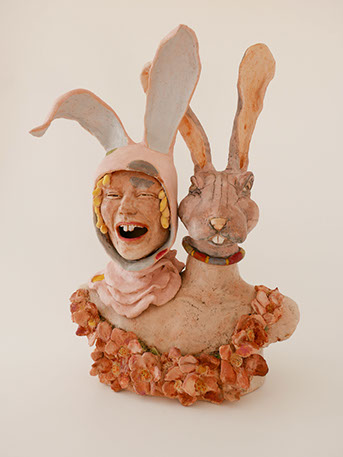
LISA CRANE
Folie à Deux, 2019
clay
22 x 17 x 9”
Courtesy of the artist
In this life-size sculpture of a two-headed creature, its appears to depict two variations of a rabbit. One is human, a laughing girl wearing a playful but elaborate rabbit hood, and the other is animal– a stern-faced hare. The closeness of the heads invites the viewer to compare and contrast these two creatures and is meant to evoke questions within the viewer about the potential relationship between them. Guided by my career practice in psychotherapy and healing, my work intentionally opens space for the interpretive through a blend of fantasy and reality. The title, Folie à Deux, is a psychiatric term for a shared delusion. This work can serve as both a window and a mirror. Viewers may see a portrayal of a close friend or loved one, or even of themselves. Is it a representation of two people sharing the same delusion, as with the psychiatric condition? Or one person who at times embodies markedly different moods or personalities? Could it represent a person’s own opposing inner feelings or desires? Perhaps like the devil and angel on one’s shoulder, is it a representation of the voices in one’s head? Our lives serve as the source for our own interpretation.
SARAH COLLINS
Folie à Deux, 2019
clay
22 x 17 x 9”
Courtesy of the artist
In this life-size sculpture of a two-headed creature, its appears to depict two variations of a rabbit. One is human, a laughing girl wearing a playful but elaborate rabbit hood, and the other is animal– a stern-faced hare. The closeness of the heads invites the viewer to compare and contrast these two creatures and is meant to evoke questions within the viewer about the potential relationship between them. Guided by my career practice in psychotherapy and healing, my work intentionally opens space for the interpretive through a blend of fantasy and reality. The title, Folie à Deux, is a psychiatric term for a shared delusion. This work can serve as both a window and a mirror. Viewers may see a portrayal of a close friend or loved one, or even of themselves. Is it a representation of two people sharing the same delusion, as with the psychiatric condition? Or one person who at times embodies markedly different moods or personalities? Could it represent a person’s own opposing inner feelings or desires? Perhaps like the devil and angel on one’s shoulder, is it a representation of the voices in one’s head? Our lives serve as the source for our own interpretation.2
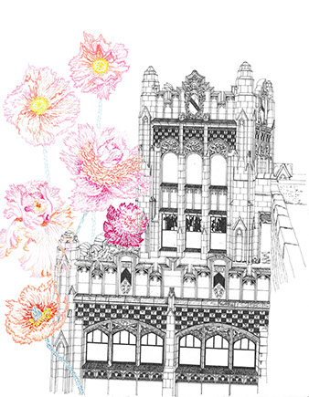
JACQUELINE DIESING
Metropolitan Building, 2019
mixed media: micron ink and
soft pastels
17 x 13“
Courtesy of the artist
The Metropolitan Building is a Neo-Gothic historic gem in Detroit. Built in 1925, it became known informally as the Jewelers Building due to the number of jewelers and watchmakers it housed. It fell victim to decay and vandali-zation when it closed and was abandoned in 1979. Luckily, it was recently restored and renovated into a hotel. Prior to its renovation, vines and trees were growing on the roof of the building, trying to surround and penetrate the building with energetic life. This piece represents a juxtaposition of two different types of beauty that complement one another. One of those beauties is vibrant, soft and fluid. The other beauty is intricately detailed, precisely revealing its decay and its preserved history.
JACQUELINE DIESING
Metropolitan Building, 2019
mixed media: micron ink and
soft pastels
17 x 13“
Courtesy of the artist
The Metropolitan Building is a Neo-Gothic historic gem in Detroit. Built in 1925, it became known informally as the Jewelers Building due to the number of jewelers and watchmakers it housed. It fell victim to decay and vandali-zation when it closed and was abandoned in 1979. Luckily, it was recently restored and renovated into a hotel. Prior to its renovation, vines and trees were growing on the roof of the building, trying to surround and penetrate the building with energetic life. This piece represents a juxtaposition of two different types of beauty that complement one another. One of those beauties is vibrant, soft and fluid. The other beauty is intricately detailed, precisely revealing its decay and its preserved history.2
TIEN DO
Rest, 2019
wall installation: glass, metal, clay 64 x 60 x 10”
Courtesy of the artist
Death has always been a curious and a taboo subject to discuss. In its own right, it has always been depicted as an antagonist of our existence, a hindrance towards our livelihood. This shouldn’t be the case, as death is a part of the cycle of living. Everything that has a beginning, has an end. Thus I hope to desensitize the concept of death by innovating the idea as a character that lives their days. No care in the world, only coexisting with life as one.
TIEN DO
Rest, 2019
wall installation: glass, metal, clay 64 x 60 x 10”
Courtesy of the artist
Death has always been a curious and a taboo subject to discuss. In its own right, it has always been depicted as an antagonist of our existence, a hindrance towards our livelihood. This shouldn’t be the case, as death is a part of the cycle of living. Everything that has a beginning, has an end. Thus I hope to desensitize the concept of death by innovating the idea as a character that lives their days. No care in the world, only coexisting with life as one.2
PAM FARKAS
Vertebral, 2018
clay
68 x 10 x 10”
Courtesy of the artist
Vertebral is a piece in my Scholars and Sages series. The wisdom of the ages is communicated not only through words but through texture in this group of sculptures. The vertebrae symbolize an underlying truth. Underneath all our differences we have this in common. Often these are the only bones that remain– signposts to a time passed. My goal as a sculptor is to create freedom of form and thought. The viewer goes on a journey following the lines and curves of each creation. These sculptures are powerful in their slender grace with a palate of color and a hard edge of jaggedness for their underlying shapes.
HELLENMAE FITZGERALD
Mr. Rabbit, 2019
oil paint on porcelain
11 x 14 x 7”
Courtesy of the artist
In a mad world, only the court jester can speak truth without fear of beheading. Mr. Rabbit is a trickster-like court jester; a play on both the Cheshire Cat with his mischievous grin and the White Rabbit from Lewis Carroll’s Alice in Wonderland. I have a soft spot in my heart for the Cheshire Cat, always causing chaos, and also for the anxiety ridden White Rabbit, always running late. Both serve as guides for Alice on her journey of self discovery. Life, with its endless to-do list, can be challenging at the best of times; add to this tyrannical governments, inequality, impending global disaster, personal issues (you name it) and life can seem hopeless. It’s essential to remain curious, to question everything and to laugh like a Mad Hatter at the insanity of it all.
ROSEMARY GIUSTI-DILLON
When My Daughters Were Mermaids, 2018
clay pinch-pots with a complex graffito design
3 x 5.25” dia. and 2.5 x 5.5” dia.
Courtesy of the artist
These pieces are from a series of crude hand build terra cotta vessels embellished with complex sgraffito designs. They reflect my own relationship with my five daughters and my longing for simpler times when they were younger and less complicated.
In mythology, mermaids have always represented strong fiercely independent female figures. In myths they are not always understood or trusted. In a mother/daughter relationship there are two forces: one hovering, and one vying to come into their own being. The nature of the relationship is steeped in conflict.
The relationship is painfully complex. It’s crude and intricate, and fascinatingly beautiful.
GAIL GLICKMAN
Who Is My Son, 2011
terracotta
28 x 12 x 18”
Courtesy of the artist
Who Is My Son is one of a series of small ceramic sculptures called Fragmented. Almost every mother has experienced a moment when they don’t recognize their own children. It is a very disconcerting feeling for a mother. This piece was made at a moment when my son and I were having a fight.
VICTORIA GORO-RAPOPORT
Hatching Out, 2018
etching, mixed media
12 x 12“
Courtesy of the artist
Hatching Out describes emotional and intellectual anguish one experiences at the birth of a new idea. Any new development or intellectual undertaking starts its existence as a fragile “hatchling.” It is impossible to predict which idea will survive and flourish, and which one will die away without making any visible impact. The entire history of human civilization can be regarded as a record of lives and deaths of new ideas. Some of them have just enough power to influence individual lives, while others sweep and take over entire continents. In the present print, I attempted to capture the state of uncertainty moments before the ultimate fate of the idea –its triumph or failure– is decided in history. possible through the slow progress of successive generations of ideas.
The human figure in the center of the print represents a vulnerable, but feisty “hatchling,” ready to take on the world. The ship, as well as wave-shaped architectural elements on the right, embody the two aspects of human civilization: creation (the ship) and destruction (the wave). Various other figures in the print combine elements of human and animal anatomy. They describe man’s transition from his “wild” existence in the “state of nature” to his present “civilized” state. Such transition was only
MARK GOUDY
Relational Forms (#878, 935), 2019
unglazed porcelain, soluble metals: gold, cobalt, chromium
9 x 7” dia. and 11 x 4.5”
Courtesy of the artist
My ceramics work is all about designing forms and making objects. My mission as an artist is first to create a coherent visual language, and then learn to speak in that language. I am motivated by the exploration of the qualities of the medium, and the experience that these physical objects project into the world. I am drawn to abstract patterns and minimalist archetypal forms that reflect the geometries of nature.
My paper-thin unglazed porcelain works are centered on the luminous qualities of this translucent material. I have pioneered the use soluble metals which allow me to color the clay and create complex patterns. After painting these watercolors on the bisque - fired clay, they interact to create halos and other boundary effects. Some of these metals flux the clay during the vitrification firing, producing surfaces that feature ‘light window’ patterns.
M. ALEXANDER GRAY
Hardware River Aqueduct III, 2017-18
engraving
7.5 x 12“
Courtesy of the artist
This is a highly detailed woodcut depicting a little-known stone arch in the Virginia countryside. The arch was constructed in the 1840s as part of a long-defunct canal system.
The piece took months to complete; as with most of my prints, they are all long-term projects and I just work on them a little at a time. It began with a drawing on the woodblock first in charcoal, then in sharpie, using photographic references. After completion of the drawing I started carving with a combination of hand tools and a flex-shaft rotary tool, taking many proofs through the carving process. Each proof informed further carving until I was satisfied with the print.
JENNIFER HALLI
Spring, 2019
Thai kozo, various clays, photographs, pins
15.5 x 15.5 x 1”
Courtesy of the artist
Spring is from a larger series of 38 letterpress prints. Each print features lines of poetry creating a cento, or collage of poems. The prints represent places I have lived and elements not so easily tucked in a suitcase when I shift homes: relationships, events, employment, places visited, paths walked, rooms, buildings, memories. Spring specifically speaks to my upbringing in South Carolina; each print is embossed with the iron rich clay from this childhood home.
ROBBIE HEIDINGER
Massachusetts Medicinals, 2018
stoneware
14 x 10 x 3.5”
Courtesy of the artist
Massachusetts Medicinals is part of my series titled Medicinal Garden and is about the destruction of our natural resources.
It is an attempt to draw attention to the beauty and function of plants that exist on our planet. The plant shapes are based on medicinal plants that I grow in my own garden. As a gardner and environmentalist, I am distressed by the plight of our planet and our ignorance of it. Climate change deniers, war mongers, and resource extraction are so far out of control that our species is doomed. I have watched the pollinating bee population decline in my own backyard in the past ten years. This series of extra large vessels is an attempt to remind, draw attention to, and voice my own political call to arms. Our planet’s garden has been polluted, the temperatures have become more extreme and unpredictable, and our society’s turn to gmo and cyborg technologies is not the answer. I make this art to remind and reflect on nature and the precariousness of this time. I consider myself an eco-feminist but really this is not an issue of sex; it is a human disaster and I am fortunate to be in a position that I can make art and share my ideas. I do hope my intentions are felt through my pieces.
MARK HENDRICKSON
Torso 1, 2019
ceramic
10.5 x 8 x 8”
Courtesy of the artist
When it comes to my ceramic work, I am a process worker. I have been hand stretching clay for 35 years from cylinders that I make three different ways. My work, for the most part, is about design element (form) and texture. This piece is part of a general series in which at various points in the stretched form, I “pinch” the form using a piece of cord which, depending on the thickness of the clay wall, can tear or fold in some places along the pinch line. The clay in this form has decomposed granite wedged into the clay body which, after being stretched into its pre “pinched” shape, gives a light somewhat pock marked and bumpy quality to the surface. This piece, because of the purposeful angle of the “pinch” in my view gives it a dancing torso look. I then sprayed a white slip over the piece before it was bisque fired. The finish on the piece is achieved by erasing a black stain (that covered the entire form) from the body and spraying a light coating of a frit, then fired to cone 2 in an electric kiln.
K. RYAN HENISEY
Trans Sebastian, 2018
watercolor, ink, marker, and metal foil
40.5 x 35”
Courtesy of the artist
Saint Sebastian reinterpreted as a Trans Man is the perfect reflection for what I see happening to Queers in the United States. The arrows of Rome that nearly took Sebastian the first time are no different than the contemporary arrows of hate and transphobia that permeate US Christianity today. The violent reaction to Sebastian’s Christianity is no less shameful than violence enacted on Queer peoples by self-claimed U.S. Christians. What is miraculous, is that we –the odd, different, and strange– continue to get up and to thrive.
Trans Sebastian is watercolor, ink, metal foil, and printed paper fragments on paper. There are thirteen arrows piercing Sebastian in the image, echoing our American past and highlighting what the artist perceives as a sacred Queer number representative of change (13 or 1+3=4). The strips of paper contain fragments from suicide notes and published studies on Trangender mortality. The setting is local to the Los Angeles area, within Santa Clarita. Sebastian is depicted in a tin-based silver foil.
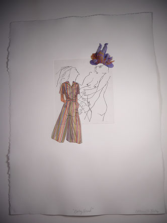
STEPHEN HORN
Baby Matrix #1, 2019
white stoneware Paperclay,
cone 06-fired
20.5 x 17.5 x .25”
Courtesy of the artist
Anyone who works in clay is confronted with a multitude of possibilities. Complexity and surprise are built into the medium, the process, and the technology. Take one purposeful step down an artistic path, and you’re immediately face to face with a crossroads that wasn’t on your mental GPS. Should you keep going straight–or, what the hell, wouldn’t it be more fun to turn left or right and see what you run into? Exploring the unexpected side roads has always appealed to me. It’s like going on a walkabout. As a teacher, I always say to students: “Try it and see what happens.” This is my own artistic mantra.
When I was recovering from cancer I turned to painting and drawing on paper-clay slabs. The method I developed for making the slabs, the printing, and painting were relatively simple, allowing me to continue exploring. Baby Matrix #1 is an exploration of textures with a juxtaposition of circles and one small floating baby. I always say to students: “Try it and see what happens.” This is my own artistic mantra.
When I was recovering from cancer I turned to painting and drawing on paper-clay slabs. The method I developed for making the slabs, the printing, and painting were relatively simple, allowing me to continue exploring. Baby Matrix #1 is an exploration of textures with a juxtaposition of circles and one small floating baby.
RICHARD HRICKO
Second Growth, 2018
woodblock on Kitakata
48 x 50“
Courtesy of the artist
My work draws upon the observation, invention, and integration of details from the natural and built environment. Like the 18th century tradition of ruins in Italian art, I express the passage of time, invoke longing and the pathos of things forgotten, but from a magnified perspective. I create compositions with natural and industrial fragments of the neighborhoods that surround my Philadelphia studio. Using light and shade, I convey the trace of a previous moment. Images of living plants, such as thick beds of locust beans or clematis prospering in urban lots, express the seemingly indestructible perseverance of nature.
My studio practice embraces new technologies and experimental approaches as well as traditional conceptions of expert print quality. In prints that explore the fusion of natural and artificial, I invent new means of integrating traditional and contemporary methods including etching, mezzotint, photogravure, photo polymer, digital photography, photo-laser relief, and intaglio printing from natural found materials. Layering textures and techniques, I explore the generative fusion of real and imaginary worlds. Most recently, I am translating small-scale photogravure ideas and processes into monumental, hand-printed laser woodcuts. I strive to produce work that speaks with authority using mysterious and subtle effects of the medium.
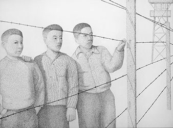
BRYAN IDA
Grandfather, 2018
ink on panel
60 x 37 x 2”
Courtesy of the artist
The intent of this portrait is to portray individuals as the embodiment of strength and pride standing in defiance to the actions of oppression and fear by a power against them. With the current social/political environment and the recent acts that repeat past mistakes I am attempting to view historic events in the context of the contemporary climate.
I reference the text from government documents and communications and use the words as my mark to render each person with the very words that affect them.
This is a portrait of my grandfather drawn from a photograph taken by Dorothea Lange when she was commissioned to photograph Japanese Americans being interned during the start of the US Entry into World War II. This photo was taken in San Francisco as my grandfather and his family were waiting to board a bus for an internment camp in Utah.
The words used to make the marks that compose this portrait are the text from Executive Order 9066, which was an Executive Order signed by FDR that established military areas excluding those of Japanese descent and establishing the internment camps away from the West Coast.
BRYAN IDA
Manzanar, 2018
ink on panel
36 x 48 x 2”
Courtesy of the artist
The intent of this portrait is to portray individuals as the embodiment of strength and pride standing in defiance to the actions of oppression and fear by a power against them. With the current social and political environment and the recent acts that repeat past mistakes I am attempting to view historic events in the context of the contemporary climate.
I reference the text from government documents and communications and used the words as my mark to render each person with the very words that affect them. Using the word in the formation of the portraits does not label or define the subject by the words used, but instead they are blended together, blurred and transformed from a label to a broader gesture that defines a new visual standard of vitality and beauty.
This is a piece based on a photo taken by Toyo Miyatake. He was a Japanese-American photographer who snuck a lens and made a camera in Manzanar, an internment camp for Japanese Americans during World War II.
The text is Executive Order 9066 and 9102. 9066 put the Japanese Americans into the camps and 9102 established the War Authority who oversaw the camps.
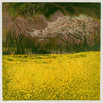
MARIKO ISHII
Dream in Spring, 2018
printmaking linocut reduction
24 x 24”
Courtesy of the artist
In mid-spring in Japan, I found the Nanohana-like master plants under the warm sunshine. Beside the field, one cherry blossom stood. Both symbolize spring and the brightness of life. I was inspired by the Nanohana and cherry blossoms representing the warmth and light of life.
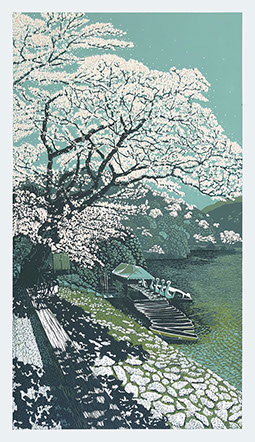
NAOTO ISHIKAWA
Sakura, Sakura, 2018 linocut reduction print
35 x 21”
Courtesy of the artist
In Sakura, Sakura, I bear witness to the wonderful interplay of tranquil time and mellow light, which had coordinated full blossom of Sakura over the floating swan boats on a local lake. It captured an eagerly-awaited moment of spring beauty of Japan after a long cold winter.
BEATRIZ JARAMILLO
Broken Ice Diptych, 2018
porcelain and black clay
11 x 22 x 1”
Courtesy of the artist
With this diptych the artist explores the melting of ice on the polar caps due to global warming. The color contrast has significance as white snow reflects radiant heat, while black exposed water absorbs it; increasing global warming.
CJ JILEK
Perspective, 2017
ceramic, underglaze, flocking
and vintage millenry elements
14 x 17 x 12”
Courtesy of the artist
Inspired by the sensuality of the natural world, I appropriate botanical forms with their openly displayed reproductive elements as a metaphor for human sexuality. By creating abstracted flower blooms with layers of detail, my intentions are to inspire the viewer to explore the work in the same way one explores nature. Eliminating the presence of stems, leaves, and roots removes the physical context of the plants allowing the viewer to focus on the form specifically in terms of its sexuality. The exaggerated forms of the stamens and pistils create a visual language making direct correlations between the botanical forms and characteristics of the human body. These biomorphic forms are designed to lead the viewer to a subconscious association between nature and the human instinct of attraction. Through my work I’m questioning ideas of beauty, eroticism, adaptation, acceptance, attraction, and desire.
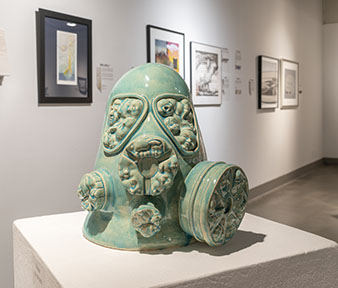
PANCHO JIMEŃEZ
Gas Mask, 2018
ceramic
14 x 13 x 15”
Courtesy of the artist
Utilizing contemporary imagery mined from commercial ceramic molds used most commonly in the decorative arts, as well as my own source imagery, I contextualize this imagery to suggest a vocabulary that is both familiar and mysterious. Melding these images into one another suggests a dreamlike state where in images, like ideas, experiences and emotions come in and out of focus. More specifically, in this piece, I incorporate figurative imagery on weapons to reflect on violence and those who are impacted by it.
JULIENNE JOHNSON
Coda 021, 2018
mixed media: Chinese ink,
archival printer’s ink, Chinese paint
38 x 29“
Courtesy of the artist
Without apology, this work is highly personal. A visual abstract of my emotional experience as a composer/songwriter, from the completion of a song, to its public release, and the feeling of finality that occurs. I work on a visceral level –only with my hands. This piece represents surprise endings; thus my title meaning, “…a closing adjunct of any movement, or piece, specially intended to enforce a feeling of completeness and finality”, which brings the piece to an end. An optional ending most often a surprise. The lower half additionally represents the mere reflection of the music heard by an audience after writing, producing and releasing a song. My experience is similar with visual art.
This work began with an archival print made from an 11’x16” photo of a mostly bluish-gray mixed media-painting incorporating collage, pigment transfers of my piano keys and torn strips of my Grammy nominated music. Next came a photo, followed with an archival print, the application of more media, more photography, digital manipulation and printing. The process continued 21 times, in varying sizes –resulting in a suite of artworks, all distinctly different– each with a surprise ending.
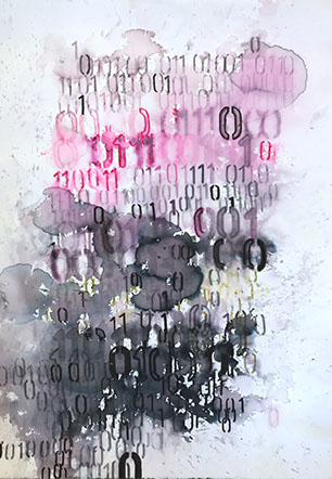
MAYA KABAT
Time Is Asymmetrical 2, 2017
pen and ink on paper
28 x 19.5“
Courtesy of the artist
This piece explores how time is not linear. Text is translated into binary code and stenciled onto paper using a variety of ink pens. Next, water is dropped like rain on the piece to disperse the ink. Finally, layers of ink were added to complete the piece. The title refers to the text coded into each piece.
ALEXIS KAMINSKY
Ice Floe, 2019
ceramic, MDF, casein and
spray paint, hardware
16 x 33 x 2.5”
Courtesy of the artist
Each series starts with an experience, often a memory. Making the work infuses the past with the present; the story changes each time it is rendered. The genesis for this series, titled Fragments, was moving back to the community where I grew up to help care for my father who has a progressively worsening dementia. At this point, the stories he can hold on to are those that he’s committed to paper, written in earlier years. My father no longer has the words or symbols to recast his memories into meaning for the present or future. Now any joy is immediate –watching the moon rise over the mountains, a bright red bird flitting, a child playing– and the loss, so enduring. It’s hard to hold these two things at once. In my studio, I arrange and rearrange my own symbols, the ceramic forms that make up my assemblages, searching for coherence or at least meaning. I will keep with this series, hoping that the process will temper the grief, and perhaps one day, I will be able to rewrite these memories of loss into something bigger.
MARZIEH KARIMI
It Was Good to Be There #1, 2016
mixed media: Polaroid photograph and clay
14 x 11 x 1.5”
Courtesy of the artist
Certain objects and places activate feelings, memories, and thoughts, which ebb and flow over time. My quiet images challenge the simultaneity of absence and presence, truth and fiction in photographs. Informed by the experience of displacement, fragmented and multidimensional thoughts compel me to revisit the past, remembering distinct moments, places, and the feelings they summon. Drawing from my photographic archive, the work constructs unlikely places that distort time and space, making psychological navigation tangible. I edit and manipulate this visual information with additive and subtractive approaches. Cutting and pasting, adhering bits of clay, and sewing with thread transport me to charged and meaningful past moments, establishing a palpable, however imagined, space.
COLEEN M KELLY
Baby Head, 2015
monoprint with Chine collé
15 x 11“
Courtesy of the artist
This body of work, Naked Under Her Clothes, is the felicitous outcome of my need to comply with a nudity ban at a civic art gallery. A long time advocate for public art and a community art activist, I found a subversive way to incorporate and defy the ban. I ‘dressed’ my figures with clothing from the envelopes of vintage dress patterns, via a printmaking technique called Chine collé. With this process, the image of the nude figure incised in the printing plate is printed on top of the dress cut-put. The resulting printed image is as if the dress were transparent. While delighted with the clever work-around that solved the problem, I found more thematic implications as I continued with the series. Feminism, women’s crafts, the tyranny of fashion, and puritanical notions of beauty all inform my work.
KYUNG MIN KIM
Did You Eat? I Love You!, 2019
mixed media floorpiece installation: clay, cotton,
linen, wood
20 x 50 x 25”
Courtesy of the artist
Because my kids are away for college, the question I ask them the most is, “Did you eat?” - the same question my mom asked me whenever I was away from home. I have now realized that the simple question, “Did you eat?”, is a mother’s way of saying “I love you.”
Did You Eat? I Love You! presents a Korean homemade dinner table. A mountain-shaped scoop of warm rice next to a bowl of hot soup are the main dishes. Each family would then assemble their own array of side-dishes; many are made from recipes passed down within the family. Serving a warm meal to her family is how a mother would welcome and care for them. She would even keep the rice bowl warm by placing it inside a cotton blanket. The cotton flower means ‘Mother’s Love’. Using white porcelain, I’ve rebuilt and re-created a resemblance of how my mother presented her dinner table to us, her family.
I love making pottery out of white porcelain, or in Korean Baik-Ja. The white porcelain clay allows me to express warm and natural beauty with exquisite detail. Baik-Ja was the most popular form of pottery in ancient Korea (Joseon Dynasty).
KYUNG MIN KIM
Did You Eat? I Love You!, 2019
mixed media floorpiece installation: clay, cotton,
linen, wood
20 x 50 x 25”
Courtesy of the artist
Because my kids are away for college, the question I ask them the most is, “Did you eat?” - the same question my mom asked me whenever I was away from home. I have now realized that the simple question, “Did you eat?”, is a mother’s way of saying “I love you.”
Did You Eat? I Love You! presents a Korean homemade dinner table. A mountain-shaped scoop of warm rice next to a bowl of hot soup are the main dishes. Each family would then assemble their own array of side-dishes; many are made from recipes passed down within the family. Serving a warm meal to her family is how a mother would welcome and care for them. She would even keep the rice bowl warm by placing it inside a cotton blanket. The cotton flower means ‘Mother’s Love’. Using white porcelain, I’ve rebuilt and re-created a resemblance of how my mother presented her dinner table to us, her family.
I love making pottery out of white porcelain, or in Korean Baik-Ja. The white porcelain clay allows me to express warm and natural beauty with exquisite detail. Baik-Ja was the most popular form of pottery in ancient Korea (Joseon Dynasty).2
AMANDA KLIMEK
Snatch, 2018
porcelain
4 x 8 x 8”
Courtesy of the artist
My practice involves pushing the limits of porcelain physically while mining its potential as a metaphor. Porcelain is fragile, resilient, a priceless art and basic utility. It contains human presence and retains memory of human touch.
Works in this series, Pristine, explore the idea of corporeal corruptibility. How a body, a land, a person can be spoiled, ruined, defiled –or alternately, preserved, kept whole, or clean. The forms conflate bodily and natural shapes to suggest themes of dissolution, contamination, erosion, and the cycle of growth and decay. The scale and presentation, along with the high finish, evoke ideas around display, preservation and perfection.
I used titles as another tool that shape my work. I think about how words and labels affect our perception and even emotions towards an object, place, or fellow human. My titles are integral to the read of each work or series, often having double or symbolic meaning.
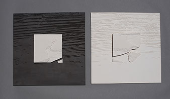
GENEVIÈVE L'HUREAUX
Fracture III, second state, 2017
etching, aquatint on
Somerset paper
22.25 x 22.5“
Courtesy of the artist
Fascinated by repetition and variations, I wanted to investigate what a mark, as elemental as a line, could do. Also, typical of most of my work, I wanted to challenge the philosophical tradition I have inherited, the one stating that contrasting concepts stand as irreconcilable polar opposites and, consequently, that we live in a world of either/or, a world of exclusion.
One by one, lines were drawn on copper plates and the forms came to be solely by determining the beginning and end of each line. In the same way, a datum took shape, providing the forms with a bearing of sort, a reference with which the forms interact.
This method of generating forms, together with the medium
(aquatint), conferred several dual qualities to the work. The forms appear simultaneously heavy and light, floating and sinking, solid and decaying, dark and luminous. We move from mass to lightness, from permanence to ephemerality, or from line to surface without any apparent contradiction, but in a seamless back and forth that blurs definitions. I believe this mirrors our human condition, and I like to think that if the work is at all destabilizing, it is because it brings us away from established norms and closer to our very essence.
SJ LANE
Animate, 2019
ceramic
16 x 8 x 2.25”
Courtesy of the artist
Almost to a fault, I notice everything; the nuances of light and shadow, the intriguing spaces between the positive and negative, and the push and pull of creation are all part of it. So, the imagery created is inspired by the infinite, mysterious, and alluring shapes in nature. The takeaway is what I design.
Forming flat slabs of clay into organic, free flowing forms feels like breathing life into an inanimate object. The rise and fall of each surface along with the bending and curving of the form come together. It’s as though I am creating my own private life form.
These one of a kind, hand-built pieces are burnished which causes the surface to become reflective, extremely smooth, intoxicating, and sensual to the touch. With the addition of horsehair to the hot clay surface, its beauty is unsurpassed.
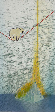
MAKO LANSELLE
On the Verge, 2018
litho, drypoint, relief, Chine collé,
hand-coloring and thread
12 x 6“
Courtesy of the artist
My inspiration for this print comes from pondering what is occurring in the Arctic. Because of rapidly melting icebergs, polar bears are losing the habitat where they hunt and raise their family. I liken the plight of these poor polar bears to standing on a tight rope. This image of polar bears is my way to visualize the impact of changes to our air, water and earth.
The changes to the climate, brought about by global warming, are the results of greenhouse gases emitted by technologies humans
have created. Most of the increase in CO2 comes from burning fossil fuels in internal combustion engines, factories and electric power
plants. Humans cut down forests that would otherwise store CO2.
I want to convey the impact of humans and global warming by showing the predicament of polar bears as one of the consequences, to draw attention to our shared concern about the ailing earth.
GINA LAWSON EGAN
Unity, 2018
ceramic, cone 02-fired, colored slips, stains and glazes
35 x 17 x 13”
Courtesy of the artist
Unity is a sculpture that celebrates the family in an interpretive collaboration involving humans, pets and wildlife. This piece is also a narrative open for the viewer to interpret.
ARIANE LEITER
Weathered Flat, 2018
clay
17 x 13.5 x 5.5”
Courtesy of the artist
Evidence of process is very significant. The marks of construction are accentuated, rather than hidden. These can be finger marks from coiling and pinching, throwing lines, or broken edges of slabs. Visible signs of the passage of time on objects in nature are important, including the peeling back of layers, erosion and changes in structure.
This piece is one of a series exploring vessel forms. The clay used is mid-range white stoneware. For additional texture in the clay body, I add homemade grog, sand, perlite, rice, etc. to clay. I coil-build, using paddles, scrapers and other tools to alter form and surface at all stages of work, including bone dry. Glaze applied to exterior and wiped off. Work is fired in a gas kiln with light reduction to cone 5-6.
CAROLYN LIESY
School Shootings: Hung Out to Dry, 2018
collograph, clothes pins, rope
24 x 67 x 3“
Courtesy of the artist
I have been asked, many times, to explain my work, and I do not think there is one explanation that works all the time. I started with photography and ended up with printmaking. I am also a biologist, and that influences my work. I gravitate to printmaking because I can use it to explore making many kinds of imagery that express a variety of things about what I see and love about the natural world.
My images are experimental, at the margins of traditional printmaking practice. I am interested in composition, love, color, and seldom edition my prints. I like to combine different styles of printmaking (etching, relief, lithography) in conceptual ways. For this work, School Shootings: Hung Out to Dry, I am struggling with a way to help end these horrific school shootings and gun violence, in general. Last year I hosted a pop-up exhibition called Don’t Shoot Me Down that focused on gun violence. I am very sad that kids have been hung out to dry while we try to find a corrective legislative solution.
It is beyond troubling that these school shootings continue. At the same time, it seems hard to get the corrective legislation passed. I think the kids have been “hung out to dry” while we figure out the solution.
ANNELL LIVINGSTON
School Shootings: Hung Out to Dry, 2018
collograph, clothes pins, rope
24 x 67 x 3“
Courtesy of the artist
It is the idea behind the work that dictates the image the viewer sees. When I create a piece of work, I am not trying to tell the viewer what to think or what to see, rather, I am creating a place for the viewer to have their own experience, to see and to think their own thoughts. Perhaps, they think of an experience that happened long ago in another time and another place, until now, forgotten, but in viewing my painting, the memory springs to life in this unexpected moment.
Just as ripples spread out when a single pebble is dropped into water, the actions of individuals can have far-reaching effects. –Dalai Lama
Through the use of geometry, I break the picture plane into many small pieces, which is a metaphor for my life experience, thought and memory. For me, nothing is ever experienced or remembered as a whole, but instead in fragments. My work relates to Cubist and Futurist paintings– in which the natural world is translated into a stark pictorial language of shapes, lines and angles. Malevich said his intention was to use geometry to convey “the primacy of pure feeling in creative art” rather than the depiction of visual objects.
From the beginning of the invention of abstraction, Geometric Abstraction has acted as a visual and theoretical counterpoint to the gestural paintings of Abstract Expressionism. To see a variety of approaches to Geometric Abstraction, visit the website Geoform, www.geoform.com.
My work can be considered color field. When looking at my paintings, the viewer might be reminded of a visual phenomenon in nature. The Japanese have a word, ‘komorebi’
[koh-moh-reh-bee] which means light filtered through leaves, specifically at the beginning of spring or fall, or of wind blowing through the leaves of trees, or sunsets in late afternoon. Everything is in a state of change. The colors are chosen as a reflection of my inner world, at the same time, reflecting the colors found in the world around me. When viewing the work, the eye of the viewer follows a color across the picture plane, they can see how the color moves and vibrates, as it changes gradually in value, temperature, intensity, or hue. Paul Gauguin said, “Color which, like music, is a matter of vibrations, reaches what is most general and therefore most indefinable in nature: its inner power.”
GLORIA LUJAN WHITNEY
Abuelita, 2018
hand-pulled woodcut on Japanese washi paper
26 x 14“
Courtesy of the artist
Abuelita is a cultural representation of my grandmother, Gregorita Meir y Gardunio y Lujan y Pacheco, the matriarch of my paternal family. Small in stature, she had floor length white hair tipped blonde because she had never cut it since she was in her teens. She lived to be 102 years old.
GINA M.
Handle with Care, 2017
assemblage floorpiece: ceramic, artist china, vintage found objects, coco mat
46 x 32 x 47”
Courtesy of the artist
The ‘bull in a china shop’ idiom is turned on itself in the ceramic and oxide sculpture Handle with Care. A toy bull, after assaulting a stack of china, twists with rage as a shattered platter pierces his side and stuffing spills out. I used my own wedding china to create this piece giving the china a chance to get even
.
In all my work there is a whimsy with a dark side. My personal narrative uses innocent childhood imagery like teddy bears, toys, and puppets to create the reactionary expressions of my inner emotional life. When something happens to me and triggers a buried emotion, a lost sentiment or a hidden pain, I must reconstruct and resurrect it outside of myself and find the story behind it.
Combining assemblage with ceramics fills my current body of work. The homespun construction and textured surfaces simulate threadbare fabric and tattered fur.
I select materials based on their authenticity to my process. I choose clay because of its fragility, its relationship to the earth, and its tradition in arts and craft. I incorporate recycled materials such as wood and found objects because of their nostalgia and reference to aging, decay and decomposition.
CONNIE MAJOR
T.V. Time, 2018
stoneware clay, high-fire glazes, glass
15 x 15 x 3”
Courtesy of the artist
This sculptural plate appears to be an American Standard porcelain sink filled with water, with dishes left soaking. The dishes are from a dinner for two and have been placed in the sink while the couple watches television. The water is melted glass and appears to have soapy foam along some plates and a bit of grease scum on the water, indicating the dishes have been there a while. It is T.V. Time.
CJ MAMMARELLA
Prophet, 2019
ink on paper
8.5 x 11“
Courtesy of the artist
If the objects in our life could speak, I wonder what tales they would tell.
You become. It takes a long time. That’s why it doesn’t happen that often to people who break easily... –The Velveteen Rabbit
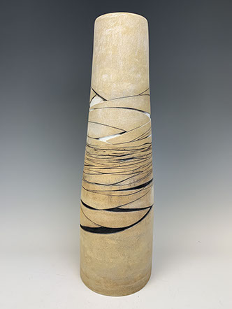
SHAHIN T. MASSOUDI
Land, 2019
ceramic
23.5 x 7 x 7”
Courtesy of the artist
Once I achieved the height, volume, and delicate lean of this clay vessel, I carved in the design onto the surface. The earthy tone of my vessel, and its tree-trunk-like posture, remind me of one’s ultimate need to belong to and be connected to a land, as a tree is.
This idea of a homeland is mirrored in the design on the surface of the trunk –an abstract hint of landscape receding into the distance. It is as if the surface of the piece is reflecting the emotional landscape that surrounds it.
My tall tree trunk vessel is built by throwing and slab. I applied under glaze to define the textures and fired it in cone 6.
GARRETT MASTERSON
Moon Rock, 2018
fired stoneware
38 x 26 x 16”
Courtesy of the artist
Over the past few years I have been working on sculptural forms that are simplified abstractions indicative of monumental landforms. Previously my sculptures were abstractions of the human figure. These abstracted forms and surface textures have moved further away from any likeness of the human form. Instead, they now take on the appearance of ancient stone markers or stelae.
Clay is a primary material for me because its tactile nature allows for a vast range of forms and surfaces. The fired clay can show qualities of soft malleability and, at the same time, express the hard permanence of stone. Fired clay can also present a variety of colors and surface qualities not found in stone or bronze. The forms in my sculptures are constructed of torn clay slabs pressed and paddled into the planes and curves of these abstracted forms.
I have learned over the years to trust my instincts; to explore the direction the work is taking without imposing a set of ideas or stipulations on the work. My process is intuitive and visceral rather than directed and imposed. I feel this allows things both conscious and subconscious to come into being.
BABETTE MAYOR
Still Waters Run Deep, 2018
digital mixed-media, colored
pencils, mono-print
21 x 16“
Courtesy of the artist
The impact of man on place is more evident than ever. I am trying to communicate the fragility, impermanence, and beauty of life through the depiction of deceased or vulnerable animals.
JEFF MILLER
Apollo’s Eye, 23, 2019
gesso, ink on paper
35 x 35“
Courtesy of the artist
The Greek and Roman god Apollo drives the sun’s golden chariot across the sky, commanding a transcendent view of the earth that, prior to 20th century human spaceflight, we knew only in dreams and the imagination. From his dispassionate and omniscient viewpoint, Apollo embodies a desire for wholeness, transcendence, and global dominion that has been actualized today across geopolitical, economic, technological and cultural realms.
These could be images of what he sees, or we could invert Apollo’s omniscient gaze and look back into his eye, examining the mechanism of sight itself: how is perception and imagination constructed on the retinal surface, the site where wavelengths of light turn into neural electric signal, the surface boundary between our external and internal worlds.
Gesso is applied to paper, various densities of India ink are applied to the surface, and through myriad degrees of absorption and resistance, a plethora of latent textures emerge. Whites absorb blacks, blacks reveal whites; the movement and interaction through the material surface reveals texture and form, just as the movement of light through the light sensitive rods and cones of the retina stimulates the optic nerves, creating electrical signals interpreted as light and dark, texture and form.
JOY NAGY
Topsy-turvy, 2019
white porcelain vessel
7.5 x 5 x 5”
Courtesy of the artist
The Topsy-Turvy vessel is based on a found object, repurposed through the technique of plaster mold making, poured porcelain slip, reconfiguration and firing at 1200 degrees. My intention to create a whimsical object slightly off balance did not reflect our world climate at first glance, but the more I work on each section the more I associated our globe and the topsy-turvy times we live in.
I am a native New York City artist who works in a variety of media including drawing, painting, and sculpture. My practice is an essential part of my life as both an act of meditation and a method of observing and understanding my environment. My work investigates and reconstructs everyday items to clarify the nature of existence and find poetic meaning in daily life. As such, I try to create works that do not follow logical criteria but are based only on intuitive associations and a desire to make a connection with the viewer.
MARIE NAGY
Drowning in Memories, 2019
ceramics
16 x 22 x 8”
Courtesy of the artist
I like making containers. Teapots and jars and even lidded cups. Somehow, I like the symbolism of putting a lid on it, keeping it contained. However, no matter how you compartmentalize your life reality will leak in and truth will come out. Lately I have spent a lot of time thinking of alcoholic beverages and past times. Was the past really better? For who and why? Did time serve as filter to soften the harsh realities of past? Was it the youth which made us ignorant or just the passage of time? People often reminisce over drinks, but then hangover and reality sinks in. I want people to just look and think rather than drown their sorrows over not living in the idealized past.
RICHARD NICKEL
Sprouts, 2018
ceramic
19.5 x 14 x 5”
Courtesy of the artist
Often art is seen as an introverted, solitary experience involving serious thought and messages. Frequently overlooked are the examples of the lighter side of human existence – comedy. Art, like life, is a balance between comedy and tragedy. Shakespeare’s darkest plays were balanced with keen wit and humor. My intent in much of my artwork is to reveal the purpose of humor in art and to show that, in art, comedy and tragedy are dependent on each other for a deeper understanding of the human condition.
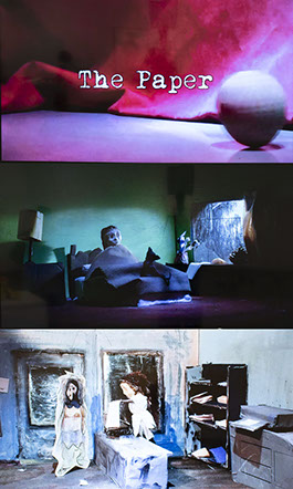
LUCAS NOVAK
The Paper, 2016
video art, stop-action claymation
2 minutes 44 seconds
Courtesy of the artist
In my video art, stop-motion animation (aka “claymation”) is the perfect art medium for trying to make sense of the inexplicable with its inherently ominous quality. I wouldn’t call myself an “animator” in the traditional sense, since my work is more of an art piece where the visuals, metaphors, and combination of music and emotion are more important than a rational storyline and how the characters move. I prefer the choppiness of stop-motion animation, where the puppets move in a somewhat broken or disjointed manner, as this adds a layer of complexity reminding us of our imperfections while also hinting at something unpredictable. It helps that unpredictability is essential to any kind of filmmaking.
DANIEL OLIVER
Urn Series, 2019
clay
14 x 9 x 9”
Courtesy of the artist
I started the Urn Series after a returning customer asked me to make him a box for his mother’s ashes. The box had to be the size or holding capacity of a shoe box. I liked the scale of it and wanted to play a little more with it making them a little bigger and playing with different shapes. I also call them treasure box.
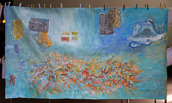
SUSAN OSSMAN
Spazieren Gehen - Going for a Spring Walk, 2017
acrylic, ink and paper on linen
48 x 84.5“
Courtesy of the artist
Spazieren Gehen (translation Going for a Stroll ) layers paper on linen in an exploration of thought formation. I explore this process through a practice of “almost writing” that appears both in page-like rectangles and in a bright cloud composed of lines and nearly letters in various scripts. I made this in Berlin in the spring, the season of regeneration –of tying up old projects and starting anew. The canvas creates a sky-blue environment for actual or imagined projects– be they of making art, writing texts or other kinds of projects from home renovation to to-do lists. In contrast to the floating yet distinctly framed “projects,” a large cloud in the center blossoms and buzzes with color and line. The collage is built up of layer upon layer of dyed and painted transparent silk paper.
The piece was one of several I made in the context of ethnographic fieldwork I did in Berlin
in 2016-2017. For that project, I used art to study scholars and their practices at an institute of advanced research. “Almost writing” is a technique I first developed to explore the difficulties of getting one’s thoughts down in writing, but it has since come to be about any struggle to create.
STEVEN OSTERLUND
Quod Opus, 2017
ceramic
28 x 11 x 12”
Courtesy of the artist
My current work is inspired by the individual’s relationship with industrial equipment along with exploring expectations of ceramic vessels. While the development of new technology is celebrated by some, it also frightens and intimidates others. At times in human history, ingenuity leads to temporary successes with unseen consequences appearing down the line. The solution to one
“problem” can lead to an unpredictable repercussion. Reflecting on the current state of the environment and lifestyle of the world’s population, the success of humans relationship with their own technology becomes questionable. I am inspired by engines, agriculture equipment, chemical apparatus, and space technology.
I am using the ceramic medium and its assumed fragility to explore mankind's relationship with machines. The modern importance of ceramic vessels for transportation and storage of resources is often overlooked. Using clay to transcribe the industrial vessels and apparatus brings them into a modern context with historical roots.
The piece was one of several I made in the context of ethnographic fieldwork I did in Berlin
in 2016-2017. For that project, I used art to study scholars and their practices at an institute of advanced research. “Almost writing” is a technique I first developed to explore the difficulties of getting one’s thoughts down in writing, but it has since come to be about any struggle to create.2
GAIL PANSKE
Quod Opus, 2017
ceramic
28 x 11 x 12”
Courtesy of the artist
Experiences of time and place are the source for much of my imagery. The inspiration for this image is a poem about mysterious and powerful female beings. My goal is to synthesize influences while maintaining my own iconography.
Through images of objects and the creation of environments, I reference experiences that are part of my daily life. The process becomes a negotiation that provides the framework for my interpretation of those experiences on an intimate and personal level, and as it relates to contemporary society. When you have time to think, to be, you see within an experience.
SARAH PETTY
Deaf Ear, 2019
porcelain, ball-point pen, cotton, wood
5.5 x 4 x 3.5”
Courtesy of the artist
I was particularly excited about this piece (left) and grateful for the theme of this show to push me to explore unconventional material pairings with clay and ink. A vitrified porcelain tile with an ear I scratched with a ball point pen sits nestled in a box of cotton balls. I love the lack of control I had as the ink conservatively and occasionally came out in spurts. I surrounded the ear with cotton balls to symbolize our inability, as a nation, to listen to each other.
SARAH PETTY
Grief, 2018
found ceramic plate, china paint
6 x 5 x 4.5”
Courtesy of the artist
The ribcage has turned up in my work to explore notions of protection. This anatomical
cage (above) is rendered on a delicate, found antique tea plate. Hard and soft, I am exploring many manifestations of being feminine and strong. As an acupuncturist, my relationship to the body has changed. I often use metaphor in both my practice and my artwork. This particular piece is an exploration on my feelings of grief and loss on a found object. It is rendered in a sort of pen and ink drawing method using china paint and fired low to cone 018. The lungs, in Chinese medicine, are the organ that feels inspiration and grief. I have exposed the lungs and shown the tears emanating from them.
ANN PHONG
A Female Refugee’s Story, 2019
litho print with acrylic
42 x 50 x 1.5”
Courtesy of the artist
My art reflects the feelings and thoughts of the people who have experienced vicissitudes in life: those who are pushed to the edge of death during war time, those who suffer through difficult living condition while escaping communism to seek freedom, and those who struggle to assimilate in a new country. We Vietnamese, in general, develop complex and restrained emotions. To survive despite the desperate situation, we reinforce ourselves with optimistic attitudes.
The formal qualities of my work are equally important. I use thick and thin layers of pigments, ambiguous and conflicting spatial arrangements, powerful and energetic brushstrokes versus tranquil and soft line to enhance an overall dynamic outlook. When the visual elements align with my feelings, it’s time for the actions to stop.
LILY PON
Dream Dress, 2018
ceramic hanging sculpture
52 x 38 x 42”
Courtesy of the artist
This work, Dream Dress, is about being in a marriage. When you see the dress from afar, you see a white, floating wedding dress. When you get closer, you can see all the lacey patterns on the dress which were created by laying countless wishbones and pieces of wishbones of various sizes. The idea came from my experience that many times in marriage there will need to be a compromise with your partner. Not many people talk openly about that before getting married. When people think about a wedding they usually talk about the dress, the party, the happily ever after, etc.
However, it’s necessary to know how to compromise when you are in a relationship if you want it to work. And it can happen many times every day. Marriage is not always easy, and it can be fragile if one person stops trying to make the effort. But if you realize that’s part of the relationship, and are both willing to do something to make each other happy and feel special, a marriage can be a beautiful thing to work for in pursuit of happiness.
MATT ROSE
Moving: A Life in 25 Houses, 2019
ceramic and chalk floorpiece
installation, composed of
several ceramic parts/objects
7 x 4 x 4” each house
Courtesy of the artist
Census data shows that, on average, a person will move a total of 11.7 times in their lifetime. I moved twelve times before turning eighteen and a total of twenty-five by the time I was thirty-five.
I’m an imagemaker by education and profession, and this is my first autobiographical work using hand-built ceramic objects in place of images to tell the story.
Being new to ceramics, my work takes on a purposeful low-craft sensibility with a level of playful, childlike sophistication which underscore the overall narrative of my life that is demonstrated in the houses. Each house is approximately the same shape and size with slight variations that come with hand building. I use the size and simplicity of form combined with the coloring and glazing to denote the physical and emotional transition throughout each move.
BRIAN ROW
Wailing Wall, 2018
ink and paper
14.875 x 21.375“
Courtesy of the artist
My interests are in the human condition and how different individuals, groups and cultures have taken the intangibles of their lives and translated them into a tangible form. Intellectual, emotional and spiritual dialogues with life manifest themselves in many ways. Being surrounded by numerous manifestations of thought, form, play, love, death, disguise and faith, they speak to me about myself. Seeking to make the intangible tangible and the tangible meaningful, I engage in the creative process for its own sake and to bring into being internal thoughts, feelings and visualizations. The works are symbolic representations of the world in which we act, interact and define ourselves.
The Wailing Wall is an expression of the deep regret for those elements of my family’s life and the lives of others that were missed or ignored due to my entanglements that too often filled my life.
HASNA SAL
The Golfer, 2018
ink on glass
12 x 10 x 1”
Courtesy of the artist
This glass rendering is called the Golfer. It shows how one can be completely isolated from the world and its built environment with air pollution and traffic noise.
Here, he is alone but not lonely. He is master of his domain. This is his sanctuary and his haven. The golfer is communicating with nature at its highest level.
I chose high fire enamel ink to sketch this in glass, and then fired it at 1500 degrees in my kiln.
NANCI SCHRIEBER-SMITH
The Pelican Brief, 2019
mixed media assemblage
7 x 9.8 x 7”
Courtesy of the artist
In the Animal Tales series, I am joining my love of stories and my love of animals with my need to create with repurposed materials. My purpose is to give new form and new meaning to the discards of our civilization. I create hand drawn kiln processed glass paintings of animal portraits and attach them to manipulated books, the titles of which are specific to animal either in personality or in subject matter.
The Pelican Brief, the image of a brown pelican was created to be attached to the repurposed and manipulated book– The Pelican Brief by John Grisham. Sheet glass from a repurposed picture frame is resized to fit the used (found) book. The front of the piece of glass is painted with a black line drawing using glass/porcelain paint. The reverse side is painted in acrylic. The painted glass image is then permanently affixed to the book. Gold chain and glass beads adorn the piece. The book, the sheet glass, and the adornments are all found and repurposed items.
MASHA SCHWEITZER
The Air We Breathe IX, 2018
monotype
17.5 x 19.5“
Courtesy of the artist
In the Animal Tales series, I am joining my love of stories and my love of animals with my need to create with repurposed materials. My purpose is to give new form and new meaning to the discards of our civilization. I create hand drawn kiln processed glass paintings of animal portraits and attach them to manipulated books, the titles of which are specific to animal either in personality or in subject matter.
The Pelican Brief, the image of a brown pelican was created to be attached to the repurposed and manipulated book– The Pelican Brief by John Grisham. Sheet glass from a repurposed picture frame is resized to fit the used (found) book. The front of the piece of glass is painted with a black line drawing using glass/porcelain paint. The reverse side is painted in acrylic. The painted glass image is then permanently affixed to the book. Gold chain and glass beads adorn the piece. The book, the sheet glass, and the adornments are all found and repurposed items.2
MASHA SCHWEITZER
Behind the Wire, 2018
monotype
14 x 21“
Courtesy of the artist
Behind the Wire depicts a subject that has been of great concern to me, due to my childhood background. The displacement of people is now a world-wide problem due to social ill, war, and economic distress. This print depict women behind barbed wire, displaced, possibly for their own protection or for problems that are not of their own making. The women look beyond the wire, into an unforgiving future.
ANITA SELTZER
Edith Wharton Tablescape, 2018
photopolymer intaglio
etching, plate
Hahnemuhle Copperplate etching
paper, Akua Ink, Charles
Brand Press.
10.25 x 7.620”
Courtesy of the artist
We are surrounded and bombarded by color, but the tonality of a monochromatic print has the power to stop us in our tracks. Unsaturated images command our attention because shape, form, texture, context, and the play of light and shadow are simplified with sharpness and freshness. They enable us to focus on the subject. They are “easy” on the eye.
Anita Seltzer is a photographer/printmaker, and as an ardent preservationist, has been memorializing historic landmarks and artifacts. She transforms her digital photographs into intaglio etchings using non-toxic photopolymer plates because she values the effort and skill needed to patiently create hand-pulled “one at a time” prints. The original images don’t rely on altered-reality manipulations. And the finished prints can’t be mechanically mass produced with the stroke of a computer key. Etchings have been created for centuries by the world’s greatest artists. The use of non-toxic photopolymer plates brings the intaglio tradition into the 21st century.
SUZANNE SIDEBOTTOM
Emptied Box, 2017
stoneware and porcelain
and underglazes
12 x 10 x 12”
Courtesy of the artist
Is it real, or is it a trick of the eye? Trompe l’oeil is the art of illusion, a game, that artists play with viewers to challenge their ideas about the nature of art and perception. I transform everyday objects and mementos of life into clay sculptures.
To a casual observer, my sculptures appear real –a toppled cardboard box overflowing with trash– a crossword puzzle, newspaper clippings, paintbrushes, a key chain, etc. In reality, they are still-life clay sculptures: manipulated, molded, and printed upon. The printed clay “papers” are made by printing on the wet clay with underglazes using artist-made printing blocks.
I love the challenge of making clay objects appear real. It forces me to use all of my former clay experience and a variety of tools. For instance, how am I going to make a texture appear on a suitcase or handbag? I want the viewer to interact with my pieces– and take a second glance. I want them to remember an experience they had in the past or perhaps a story they read.
When you view my sculptures it is not what you see… “It’s clay.”
SIERRA SLENTZ
Invasive and Unsustainable Ashtray Series, 2018
wall installation: ceramic earthenware, glaze, luster, decal, wood, spraypaint
16 x 62.5 x 8”
Courtesy of the artist
I started photographing discarded items in the desert, leaving small ceramic sculptures as a type of cairn to mark spots where I had visited or picked up trash. This led to further investigation of artifact versus trash and how archaeologist use trash piles to date historically significant sites. In an act of cleaning the landscape, I inadvertently erased a future archaeological marker. The act of leaving a cairn and collecting trash became symbols, or a tick on a timeline, that had now become erased. My current work investigates the ”human mark” on the landscape and the contrast of urban environments and uninhabited areas of the Mojave desert. This series of ceramic slip cast ashtrays are a nod to souvenirs from roadside attractions of a past era and commentary on current environmental concerns.
SIERRA SLENTZ
Invasive and Unsustainable Ashtray Series, 2018
wall installation: ceramic earthenware, glaze, luster, decal, wood, spraypaint
16 x 62.5 x 8”
Courtesy of the artist
I started photographing discarded items in the desert, leaving small ceramic sculptures as a type of cairn to mark spots where I had visited or picked up trash. This led to further investigation of artifact versus trash and how archaeologist use trash piles to date historically significant sites. In an act of cleaning the landscape, I inadvertently erased a future archaeological marker. The act of leaving a cairn and collecting trash became symbols, or a tick on a timeline, that had now become erased. My current work investigates the ”human mark” on the landscape and the contrast of urban environments and uninhabited areas of the Mojave desert. This series of ceramic slip cast ashtrays are a nod to souvenirs from roadside attractions of a past era and commentary on current environmental concerns.2
ETHAN SNOW
Formal Considerations, 2019
porcelain, paper
6 x 5 x 3”
Courtesy of the artist
I seek to negotiate the elements of material and form through this non-representational work with the aim of harmoniously balancing the two, creating visually pleasing results. My materials are restricted to paper, ceramics, pigments, and light, and I seek to explore their potentialities at the most basic level. Without preconceived notions, I proceed with an openness to discovery, allowing my work to transform with new properties of and relationships between the materials revealing themselves. The attentive consideration of the formal elements of line, form, texture, and composition give shape to my work. The guiding principle in my compositions is the very possibility of beauty; the chance to create pleasure out of seemingly simple visual forms. The technical and intellectual challenge of mediating a successful interchange of both material and formal elements with visually pleasing results brings to light my aim to create art for the purest experience of art: the unfiltered moment in which the viewer is, perhaps inexplicably, satisfied and thrilled. This is what gives the work, as well as my practice, meaning.
JANE SPRINGWATER
Out of Darkness, 2018
etching and aquatint; Sharpie-resist drawing on copper plate
17 x 16”
Courtesy of the artist
In works on paper that are simultaneously free flowing and highly structured, I impose a set of rules that govern the ordering and repetition of marks or gestures. I investigate the potential of these systems to generate intricate patterns and unexpectedly evocative forms.
From a distance, each composition suggests a tonal field of grey and black with subtle variation in texture and depth. Drawing closer, the marks become visible, gradually revealing greater complexity over time. Slowly, like an object coming into focus under a microscope, the logic of the work becomes discernible, even as the particulars of execution remain elusive. Just as I become lost in the experience of making, I want the viewer to be immersed in the temporality of seeing.
I have been working on four distinct series: Between The Lines; In Motion; Continuous Line; and Decelerating. While each reflects a different set of assumptions and rules, all manifest the concept of automatic repetition of a committed line.
Out Of Darkness is part of the In Motion series, consisting of repeated undulating lines, superimposed over each other to create layered textures, giving an appearance of depth and mirroring the gestural arm motion used to create them.
HOWARD STEENWYK
Industrial Impressionism, 2018
two-color silkscreen print on
canvas mounted to board,
ed. 1 of 3
18 x 24 x 1”
Courtesy of the artist
We were watching The Impressionists: Painting and Revolution, a four-part series chronicling various impressionist artists, painting techniques and their lives. The narrator described the Impressionists as revolutionaries who saw the world in a new way. While the Impressionists were revolutionaries, they portrayed, not saw, the world in a new way. The thought of seeing the world in a new way led to the Seeing Red series, pieces that are created with the intent of being viewed through a filter, allowing you to deconstruct or focus on different parts of the finished piece. Industrial Impressionism combines a classic impressionist still life and a contemporary assemblage of related consumer products. This is an edition that is presented in various color combinations.
Filters are supplied with the work for viewing while on exhibition. Viewing the image through the filter reveals a hidden yet poignant juxtaposition of subject matter.
SUZANNE STORER
The Couple, 2017
ceramic wall sculpture in
high-relief;
based on life drawing, raised
slab construction
24 x 18 x 6.5”
Courtesy of the artist
For ten years I have been combining high-relief form with line. Almost all of my sculptures for the wall are based upon figurative drawings from life. Expanding portions of these two-dimensional drawings into variations of three-dimensional makes for interesting perspectives, shapes, and sometimes surprising forms. The resulting sculpture is more real to me than the drawing because the drawing is only an illusion.
The sparse fluid line brushed across the surface of this relief sculpture captures the relaxed loving nature of this couple. By working in high relief I’m able to combine the best of both worlds –drawing on a smooth undulating surface combined with the heightened reality and strength of three-dimensional clay form and mass.
I aim for free-flowing movement of my brush across the smooth silky form. If I have expanded the form correctly, the brush will find its own way over the undulating form in the correct direction. I sometimes think of my work as expanded drawings. Working this way I can best present the human condition as I see it
KATIE STUBBLEFIELD
Glade, 2019
woodcut print with aluminum
tape in a Ribba frame
20 x 28”
Courtesy of the artist
This new woodcut print explores order, chaos, and entropy. This value-based print take visual cues from the natural and manufactured resources: salvaged trees, rebar, concrete, discarded clothes, deconstructed architecture and disused vehicle parts interwoven, tangled and refigured visually in space. The imagery is informed by site visits, forensic photography, first-hand accounts and evidence of changed/damaged/evolving environments.
DEANE SWICK
AB/610/19, Artist’s Book, 2019
printer’s ink, acrylic,
gouache, graphite
8.75 x 23 x .75”
Courtesy of the artist
Investigations on the origins of life, the very universe itself, and our place in the grand scheme of it all, defies easy pictorial representation. Nature has become a convention used by artists over the centuries to characterize this inquiry –a tradition I continue to pursue in my work.
A love of nature’s rugged beauty and majesty has inspired me to combine two beloved practices –hiking and painting. Years of drawing and painting outdoors have yielded the invented and imagined images found in my work. Unique, hand-made books, utilizing traditional book structures, reflect a lifetime devotion to reading and art-making.
My artist’s books are created to be intimate and tactile; the mere act of holding the book in their hands engages and seduces the viewer to participate in a unique and private dialogue. The content of this particular book includes a narrative alongside the images, reflecting the passage of time, for humans and trees.
Will these images be all that are left of a bountiful nature?
NINA TEMPLE
Marvin, 2018
clay, acrylic and ink
18.5 x 19.5 x 16.25”
Courtesy of the artist
II am captivated by biomorphic shapes. My approach to form is done in a non-objective intuitive manner, often referred to as “organic abstraction.” The shapes that I work with and create are a direct reflection of my interests in life, including my love for art, music, nature, traveling and hiking throughout the world. As in nature, my shapes take on a figurative style.
I allow the process to develop naturally without any preconception of what I will create. The influences in my life have created a strong focus on color, organic shapes and design elements in my work. My abstract references to shapes are executed using water-based clay in my sculptures with acrylic and ink. All my sculptures remain as originals without reproduction.
The creative process is deeply personal. It is an expression of my life’s journey, my beliefs and the depths of who I am.
LAURA TERRY
A Book of Maps, 2017
monoprint collage with graphite
and hand-stitching
24 x 36.5“
Courtesy of the artist
I am interested in the patterns of nature. This monoprint collage is a study of the geological layers that exist in the landscape. The layers are frozen in time, recording the history of a particular place. My eyes are cameras with lenses both microscopic and wide-angled. I record the landscape observant of these opposites. When viewed from a distance, the composition could be seen as a larger landscape, but when inspected closely, the textures and individual layers have more character. This monoprint measures the differences in the landscape, using the horizontal striations balanced by the printed line as a datum.
TAKAO TOMONO
Message, 2018
clay
17 x 12 x 3.5”
Courtesy of the artist
Much of my early work was marked by a gutsy quality and a celebration of the shibui character of many Japanese artforms. My early series of ceramic pieces features rough surfaces, dark colors and, in many cases, a feeling of age. Some of them bore elements of calligraphy. Message continues this series, but attempts to be more subtle and more mysterious –suggesting a secret message... perhaps. While earlier vessels used ancient runes or patterns that hint at strange letters, Message is simpler and more abstract. It never quite clearly gives a message, only suggests its possibility. Message moves on from the innocence of youth to the awareness of deeper meanings in maturity.
NORIHO URIU
Infinite Passage, 2017
intaglio and mixed media
18 x 24“
Courtesy of the artist
People are moving in and out on a global scale. Once in a while, we come together, but it will never be same. The looped line expresses our infinite passage.
PETER VAN AEL
Sharing a Sprig 1, 2018
reduction woodcut
20 x 16“
Courtesy of the artist
Sharing a Sprig 1 is a reduction woodcut depicting two moths sharing a sprig of grass. Peter Van Ael’s creative research is informed by his interest in pattern, camouflage, mimicry, layering, and relative scale. His studio practice is focused on the reduction woodcut. He finds inspiration in both the natural and human-made worlds, creating works from observation and interpretation, rather than documenting his environment.
BRANDON WALLS
Dream a Little Dream, 2019
polyester plate lithography
and drypoint on paper
22 x 17“
Courtesy of the artist
Much of my recent work has included shades of blue and fields of stars. I’m particularly interested in the human activity of grouping stars into pictorial representations of constellations. Anyone who has spent time under very dark skies, overwhelmed by the vast number of visible points of light, might wonder not only how earlier civilizations found patterns among the seeming randomness appearing above them, but also how they shaped these patterns into animals and creatures they were familiar with in the visible daytime world. In the West, the constellations we know may have originated with the ancient Babylonians, but civilizations in Asia and the Southern hemisphere likewise saw patterns in the starscape above them. I believe this consideration is as important to our understanding of ancient art-making, of ancient image creation, such as the earliest cave paintings. Dream a Little Dream features a sleeping girl beneath a field of stars which she herself dreams into existence. With the exception of the best-known portion of Ursa major, the stars represented here do not correlate with the actual night sky, underscoring the dreaming figure’s creation of her own night sky, as well as my own.
SYLVIA SOLOCHECK WALTERS
Dream a Little Dream, 2019
polyester plate lithography
and drypoint on paper
22 x 17“
Courtesy of the artist
Over the last few years, my prints and related drawings have focused on issues surrounding animal abuse, the environment, and the decline of the natural world as I once knew it. The Adored and Aggrieved pairs the image of a “Praiseworthy Chicken” as conceived in ancient religions and cultures, with a huddled flock of “industrial chickens,” demeaned and awaiting an unsavory fate. If it was once thought of as a symbol of wisdom, courage and maternal love, today the chicken has largely lost its lofty place in our imagination as well as its ability to live its life and express itself naturally in the everyday world. The differences and inequities seen in this print between the revered bird and its lumpen, maltreated cousins could also echo our own divided class and social structures.
My principal medium is color woodcut –hand-printed from a single block using a reductive process and multiple acetate stencils.
SABRINA WELD-FELDMEN
Whenever Her Mother Turned Her Head, 2019
ceramic
23.5 x 14 x 14”
Courtesy of the artistist
Each of my pieces in this particular series are folk tales of finding confidence in adversity. They are igniting their own beauty, bravery, and power from something uncomfortable - in coming to terms with a personal truth. Imagined in characters and forms that are cracked, quirky, or imperfect, these pieces aim to invoke a feeling of vulnerability, yet create a sense of fortitude in their risk and exposure. Their confidence is strengthened by a sense of purpose.
Whenever Her Mother Turned Her Head illustrates the course of making light of a heavyweight #MeToo.
KATIE YANG
Chance, 2018
clay infused with smoke
5.75 x 6 x 5.5”
Courtesy of the artist
My abstract ceramic sculptures seek to balance control and deliberate intent with chance. By integrating formalistic styles, random processes and naturalistic elements, my work travels between the known and the unknowable, what we can and cannot control, and searches for our ever-shifting point of equilibrium. We want to understand whether our universe and our lives are truly random or ruled by principles that we do not yet understand. Is our sense of control illusory, a myth we tell ourselves in order to cope?
KATHY YOSHIHARA
Going Home, 2019
cone 10-fired ceramic sculpture
12 x 20 x 14”
Courtesy of the artist
This is part of a series of pieces I created to explore the incarceration of the Japanese
Americans during WWII. As internees were released, they packed the few items they brought and the “new” items they crafted in camp. The tired boy is resting on the family crate, and dreaming of going home. The tall glass background shows the loading of crates onto trucks, and mountains that surrounded the camp. The shorter glass background represents the outside hostile environments that the internees will face once they leave the camp.
NANCY YOUNG
Azul, 2017
etching
8 x 18“
Courtesy of the artist
The color of the ocean, the color of his eyes– azul. Often I circle back to personal experiences, memories of those now gone. The visual impression of people and places, how they are stored and altered in memory through the act of loss and remembrance.
This image is of a point in time, and evokes feelings of days before the subject was gone. The etching and aquatint process was another way to say goodbye. The color of the paper, the color of ink, represent the memory fading into a softer place in my mind.
JIM ZVER
Hallucination #16, 2019
India ink, charcoal on paper
26 x 22“
Courtesy of the artist
The ongoing Hallucination Series of collages reference and sometimes directly quote from a suite of drawings done over a three month period in Madrid, Spain. The curvilinear and convoluted forms of the drawings emphasize and enhance their dreamlike quality. A Spanish friend, Luis Rangel, began referring to them as hallucinations, which increasingly seemed to be an apt description and title.
I titled the drawings Alucinaciones since they were done in Spain and the title was suggested by a Spaniard. These new collages, so informed by the drawings but done in Los Angeles, use the English Hallucinations as their title.
|<<
>>|
122 - 123
<
>
Copyright Kellogg Art Gallery 2019